Selected work
Jemini Payroll — the industry didn’t need fixing, the experience did
Ten years rebuilding payroll & HR around a single, modular UI language — from prototype to 30 enterprise customers across NZ and AU.
Role
Designer → Design lead → Product lead → Shareholder
Tenure
10 years · founding team
Years
2014 – 2024
Status
Exited · 30 enterprise customers
The origin
2014 — first prototypes built directly with the founder. I was the only designer for the first two years. Built the design system, the tokens, the UI architecture from scratch.
The reframe
Payroll wasn’t broken — but every product in the market looked like legacy software. Jemini’s bet: simplicity, automation, and a seamless payroll + HR product that didn’t compete on price.
The hypothesis
“If a user learns one flow in one module, every other module should follow the same pattern. Adoption is the real cost of enterprise software — and consistency is how you remove it.”
Three design decisions
The moves that defined the product
01
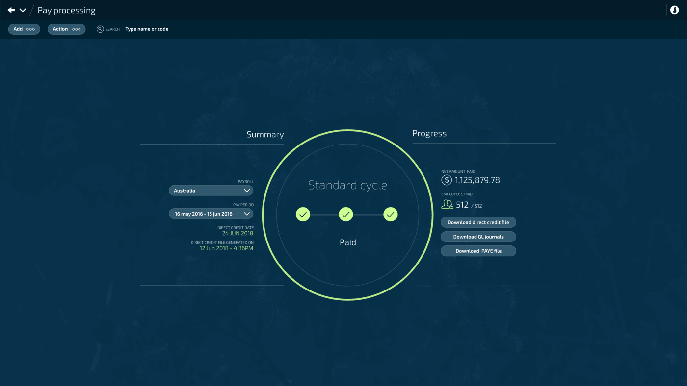
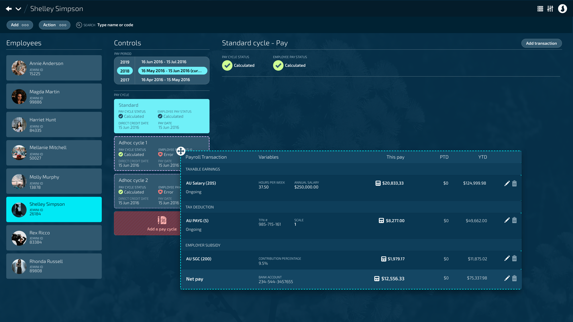
One-click pay — calculations move to the background
Competitors: 5 config screens, hours per pay, full recalculation on every change. Jemini stored every choice and ran calculations continuously in the background — so running pay became a single confirmation, with direct credit and IRD lodgement included.

02
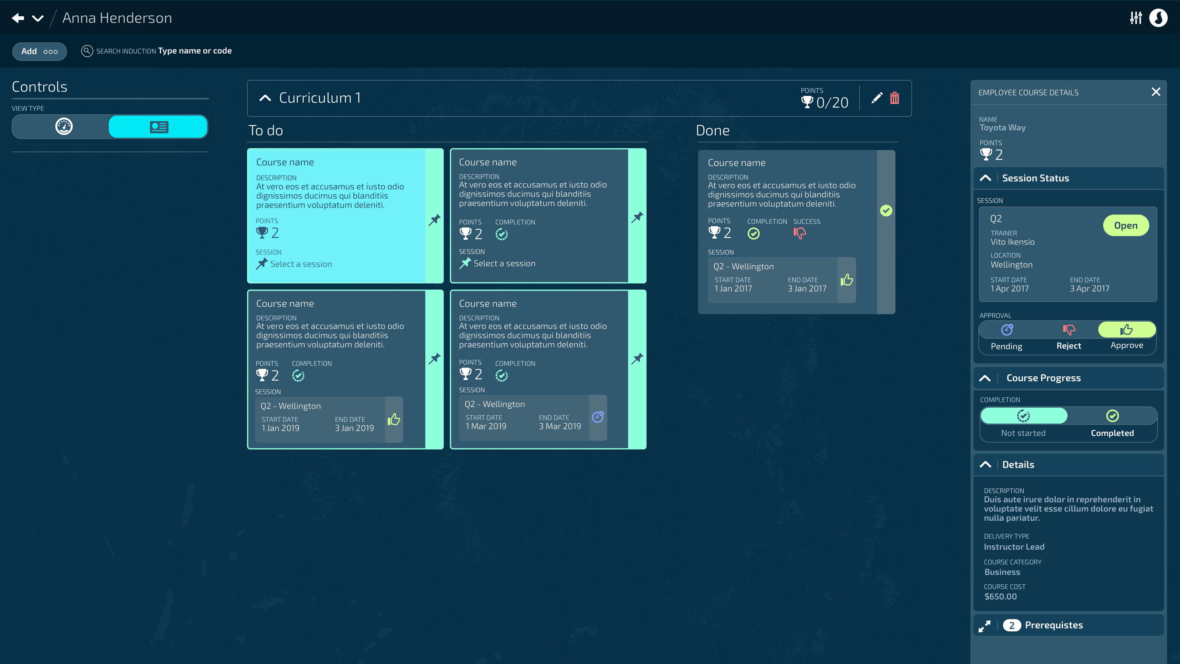
Modular UI architecture — views, lists, panels, backpacks
A small set of components — views, lists, panels, workflows, and the "backpack" (a cross-module record picker) — used identically across every module. The backpack let one module read records from another while forcing the whole UI into a shared pattern. Learn one flow, you've learned them all.
03
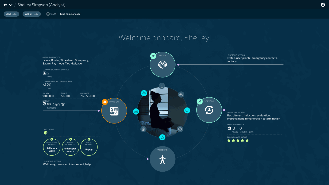
Payroll and HR as one seamless product
In 2014, payroll and HR were almost always two separate systems. Jemini merged them into one experience — same components, same data, person-centred lifecycle navigation — so changes flowed without integration friction. The UX was the differentiator on every sales pitch.
Ten years, four roles
Y1 – Y2
Sole designer
Design system, tokens, UI architecture
Y3 – Y5
Design lead
Roadmap, sales strategy with founder
Y6 – Y10
Product lead
Team grew 2 → 5 (BA, design, docs)
Y7
Shareholder
Equity granted
Y9 – Y10
Exit
Sold shares Y9, departed Y10
The mechanism — five components, every module
What made the consistency possible
Component 01
Views
Canonical screen pattern
Component 02
Lists
Records as rows
Component 03
Panels
Contextual edit surface
Component 04
Workflows
Guided multi-step
Component 05 · key
Backpack
Cross-module record picker · forces shared UX
solid border = the unique component · dashed = standard pattern
Trade-off rejected
Rejected
Per-module UX
Competitors shipped each module with its own flow, layout, and patterns. Jemini refused — every module reused the same components, the same workflows, the same vocabulary. Adoption and training are the real cost of enterprise software. Consistency was the lever.
Outcomes
Metric 01
~30
enterprise customers · NZ + AU
Metric 02
150 → 2,000
Toyota NZ · corporate → all dealers
Metric 03
5 → 1
screens to run pay · vs competitors
Metric 04
2 → 5
product team grew over tenure
Qualitative outcome · first customer
Toyota NZ — started with 150-person corporate office, expanded to all NZ dealers, ~2,000 users. Anchor customer that proved the model.
Qualitative outcome · last customer
NZQA — drove the product to extend payroll for seasonal workers, where most payroll software only handles permanent employees. The product kept evolving until exit.
What I learned
Enterprise software wins on adoption, not features. Modular UI is a business strategy, not a design preference — it lowers training cost, shortens sales cycles, and lets a small team move fast across many modules. Working daily with the founder for ten years taught me that product, sales, and design are one conversation, not three.
What carried forward
The Jemini playbook — modular components, cross-module pickers, person-centred navigation, one-click critical actions — became the foundation for everything I built afterwards. The design system thinking from Year 1 still shapes how I scope, prototype, and ship today.